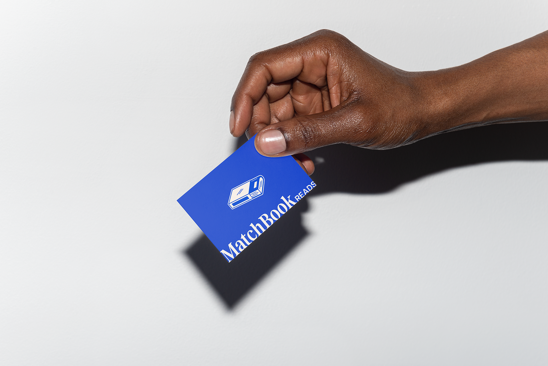
A little spark for your next great read.
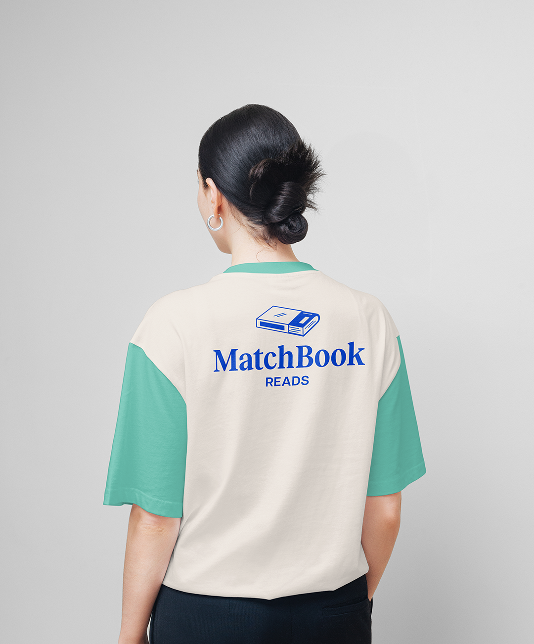
Creating an identity for curious readers.
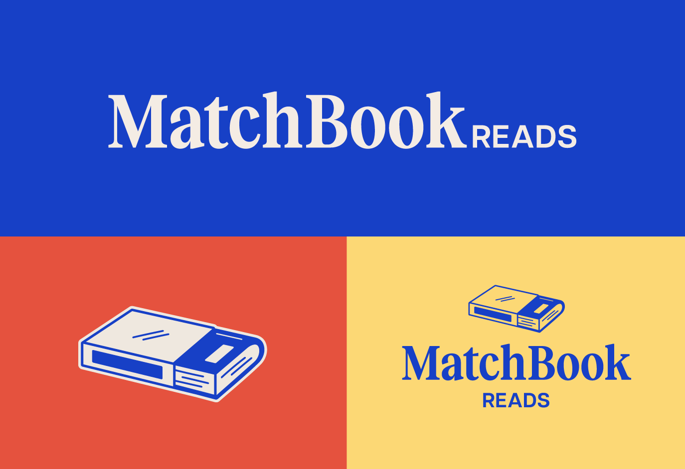
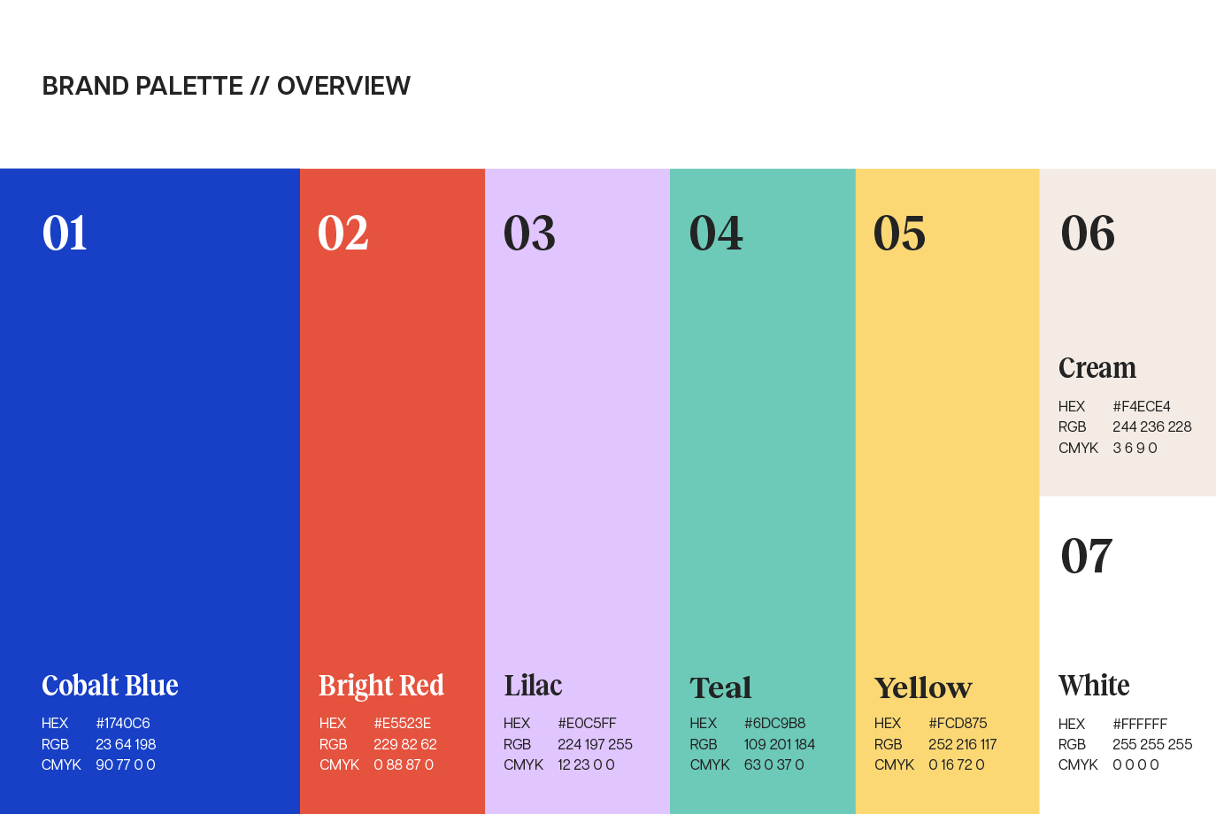
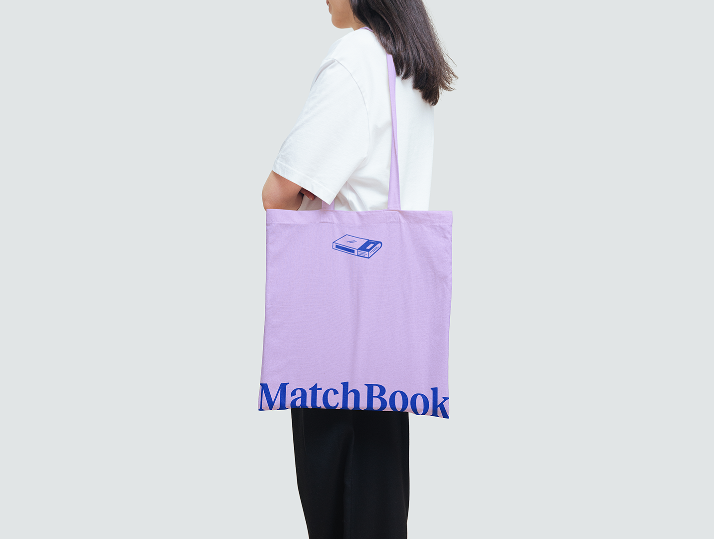
Matchbook Reads is a subscription-based book service that takes the guesswork out of finding your next great read. Through a simple questionnaire, subscribers share their reading preferences and interests, which help inform a hand-curated selection of books delivered to their door each month. Whether you're looking to get back into reading, venture into a new genre, or simply discover something beyond your usual bookshelf, Matchbook Reads makes finding your next favorite a little easier. I was tasked with developing the brand's visual identity, including a collection of logo variations and a custom color palette. The one must-have from the owner? A matchbook-inspired logo mark that still felt distinctly bookish. I brought the concept to life through a hand-drawn illustrative approach that gave the brand a little extra character. From there, I explored a range of custom typography treatments, giving the logo flexibility across different applications.
A brand that makes reading feel not so scary.
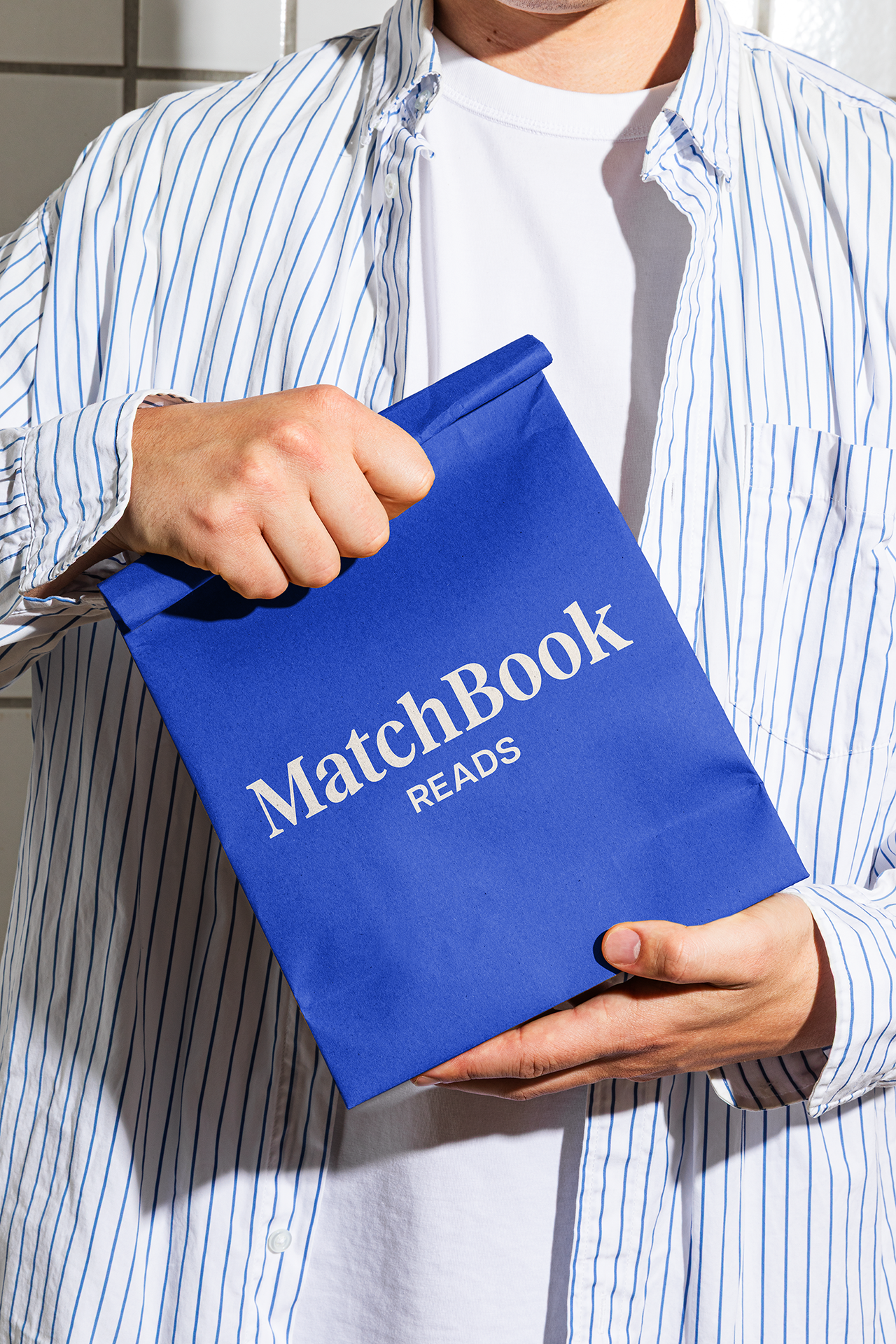
We ended up with a playful, approachable identity built around a simple idea: making it easier to find your next great read. The hand-drawn matchbook illustration gives the brand a memorable visual anchor, while the custom typography and vibrant color palette bring warmth and personality to the overall system. Together, these elements help take some of the intimidation out of discovering new books and make the experience feel a little more personal from the very first impression.